🌍 What is the globe?
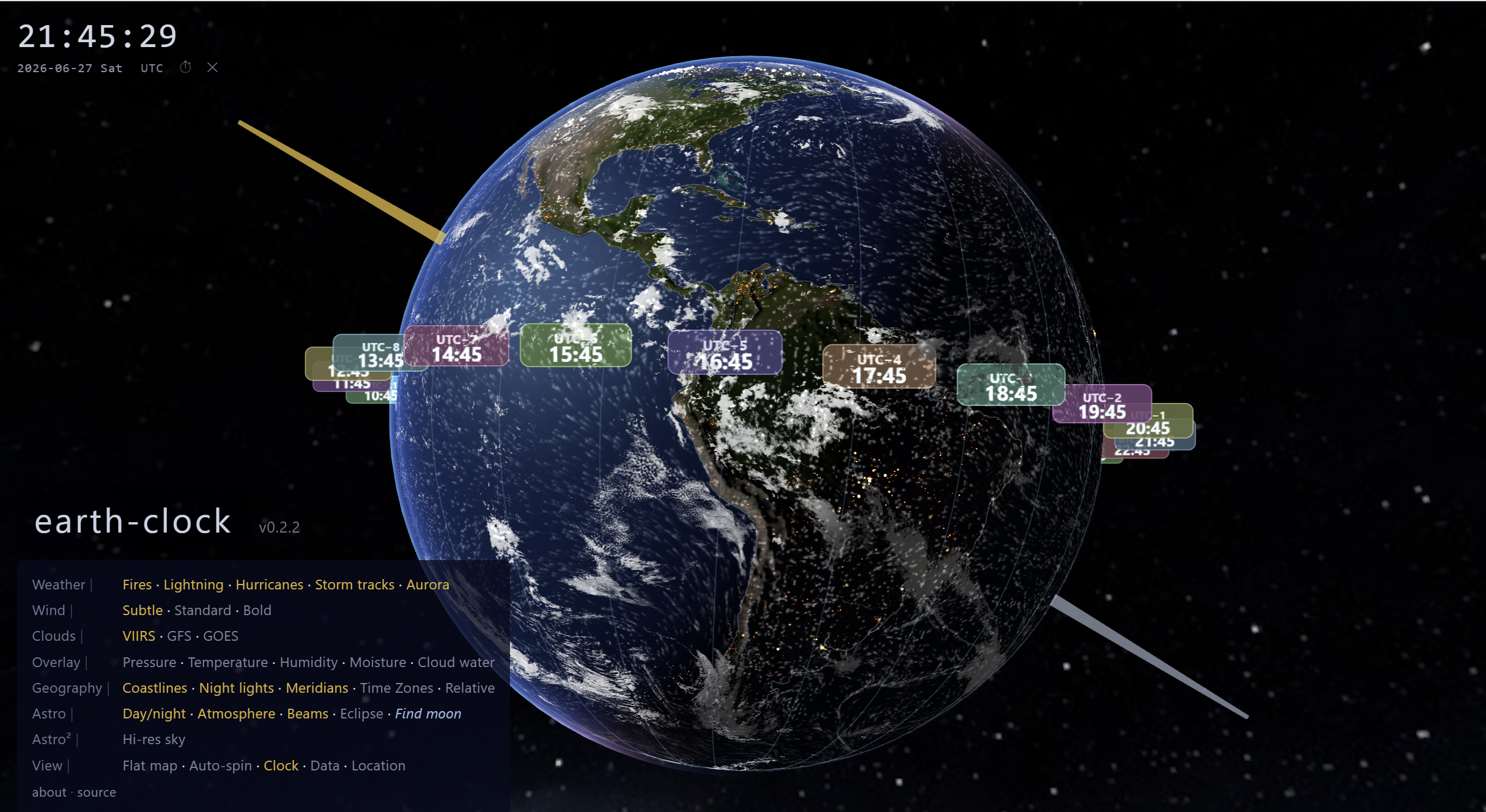
The globe in the middle is planet Earth, spinning just like the real thing. The bright part is daytime — that's where the sun is shining on Earth right now. The dark part is night-time — those little glowing dots are city lights seen from space.
There's a gold arm stretching away from the globe. Follow it with your eyes and you'll reach the sun. There's a silver arm too — that one points to the moon. Both are pointing to exactly where the sun and moon are in space right now.
🖱️ How do you use it?
earth-clock is interactive — you control what you see. Here's how:
- Drag the globe with your mouse (or finger on a tablet) to spin it around.
- Scroll (or pinch) to zoom in close or zoom way out.
- Click anywhere on Earth (with Location turned on) to find out the place name and local time there.
The menu — turning layers on and off
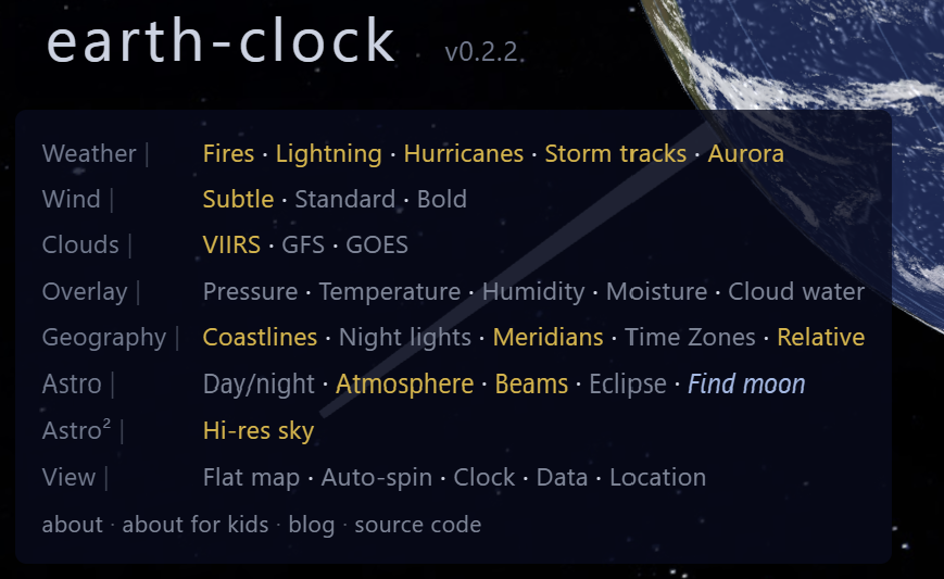
In the bottom-left corner you'll see a menu. It has rows of options like Weather, Clouds, Geography, and more. Each option is a layer you can switch on or off just by clicking it.
Yellow or bright text = turned ON. Grey text = turned off. You can have as many layers on at once as you like — try turning on Fires, Lightning, and Time Zones all at the same time!
🕰️ Why is it called a clock?
Normally a clock is something you hang on the wall. But what does a clock actually show you? It shows you where the Earth has rotated to since midnight.
Instead of showing you a number, earth-clock shows you the whole planet — you can see exactly where the sun is and where the night side is. That is the time. No numbers needed.
The floating labels
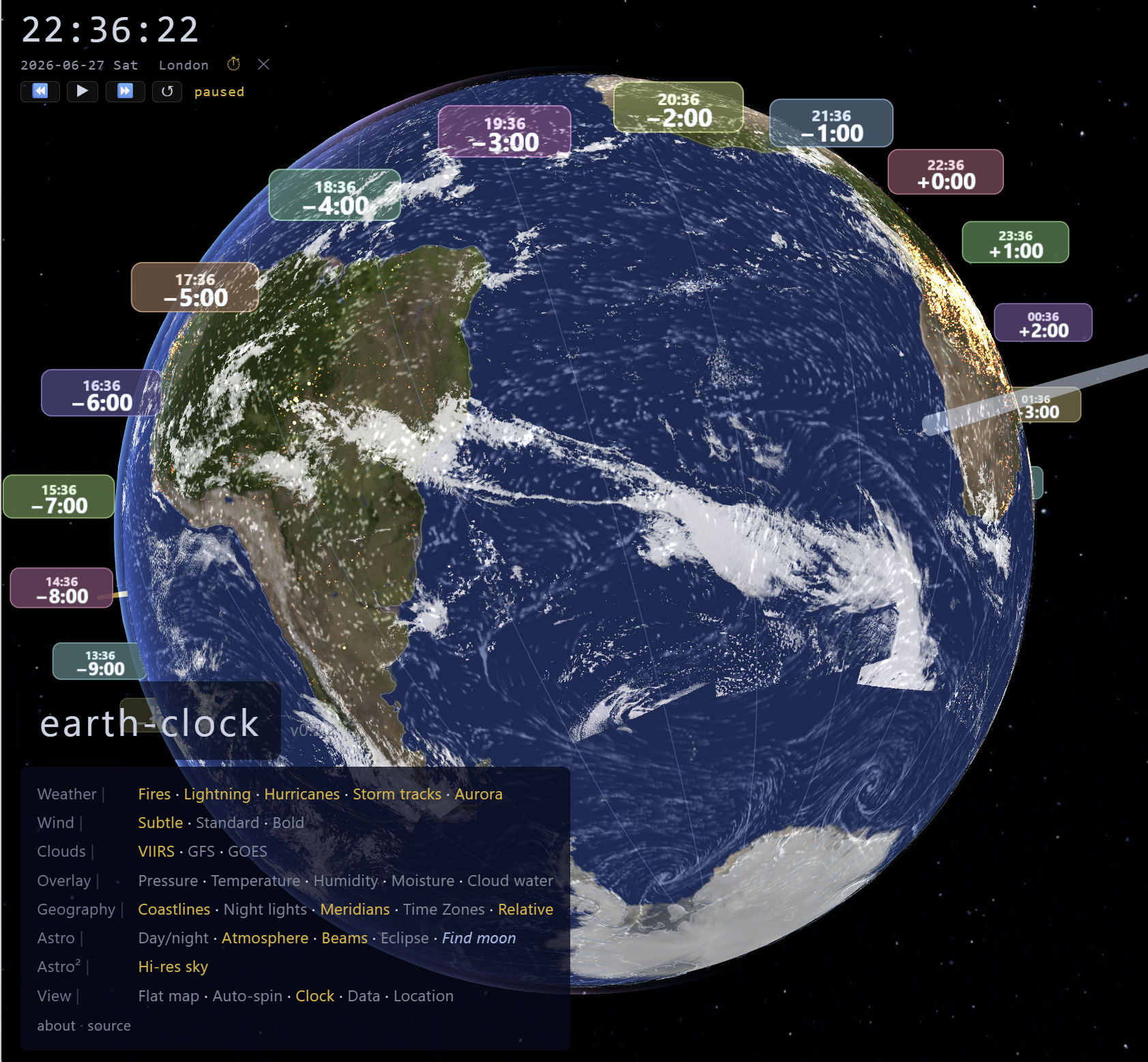
You'll see coloured pills floating around the middle of the globe. Each one shows what time it is in a different part of the world. The pill for UTC+1 (Central Europe) shows the time in places like France and Germany. The pill for UTC-5 shows the time in New York.
They're all different times, but it's the same moment on Earth — the planet just happens to be in a different position relative to the sun for each place.
🌦️ What about the clouds and weather?
The white swirls you see on the globe are real clouds. A satellite called NOAA-20 flies 824 km above Earth and takes photos every day. Those photos get stitched together into one giant picture that wraps around the globe here — so you're looking at yesterday's actual clouds over every part of the planet.
Wind
The flowing lines you can see drifting across the surface are wind. Every six hours, a giant weather computer called GFS (run by NOAA in America) calculates the wind speed and direction at every point on Earth. earth-clock uses that data to draw 65,536 tiny particles all moving in the real wind direction — that's what makes the flowing pattern you see.
Storms
If there's a hurricane or typhoon anywhere in the world, you'll see a spinning spiral on the globe. These are updated every 15 minutes from live hurricane data. The bigger and more intense the storm, the brighter the spiral. You can even see the forecast track — where the storm is expected to go over the next five days.
🌋 Earthquakes and volcanoes
Earth isn't just weather on the outside — it's alive on the inside too. The ground under your feet is made of giant puzzle pieces called tectonic plates, and they're always moving, just incredibly slowly (about as fast as your fingernails grow).
Plates
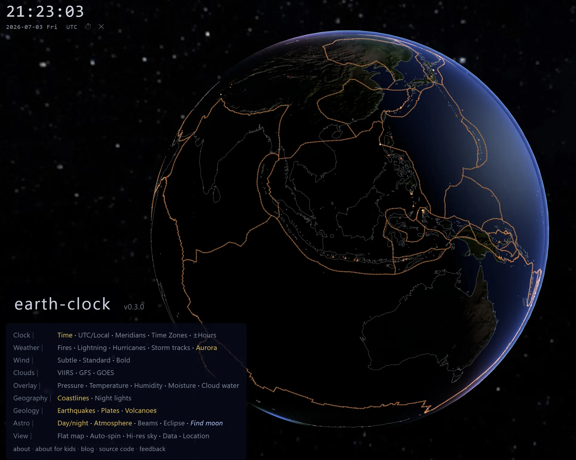
Turn on Plates (in the Geology row) and orange lines appear tracing the edges of these giant puzzle pieces. Most earthquakes and volcanoes happen right along these lines — that's not a coincidence, it's where the plates grind past each other, pull apart, or crash together.
Earthquakes
Turn on Earthquakes and you'll see every earthquake from the past week, anywhere in the world. Bigger dots mean a bigger earthquake. The colour tells you how deep underground it happened — red means close to the surface, blue means deep down.
Volcanoes
Turn on Volcanoes and you'll see over a thousand little triangle markers — every volcano scientists know about. Most just sit there quietly. But if one starts glowing hot and pulsing, that means satellites have spotted heat coming from it right now — it might be erupting!
☀️🌙 The sun and the moon
Both the sun and the moon move across the sky because of the Earth's spin and orbit. Scientists have very precise equations — like very complicated maths — that tell us exactly where they are at any moment in time.
earth-clock uses those equations. Every second, it calculates where the sun and moon should be in 3D space and moves them there. The gold arm always points at the sun's real position. The silver arm always points at the moon's real position.
The pole to pole stick
See the thin blue stick poking out of the top and bottom of the globe, marked N and S? That's Earth's axis — the imaginary line Earth spins around, like the stick through the middle of a spinning top. It goes in at the North Pole and comes out at the South Pole.
Just under the N there's a little circle with an arrow. It shows which way Earth spins. If you floated above the North Pole and looked down, Earth would be turning anticlockwise. That's why the sun always rises in the east — your side of the world is turning towards it!
The two rings
There are two rings around the globe. The blue ring is the equator, the line around Earth's middle, halfway between the poles. The gold ring is the path the sun seems to travel along over a whole year. The gold sun arm always touches the globe somewhere on the gold ring.
The two rings aren't lined up — they cross at an angle, because Earth is tilted. That tilt is why we have seasons. In June the sun is over the top half of the gold ring, so it's summer in the north. In December it's over the bottom half, so it's summer in Australia instead.
Finding the moon
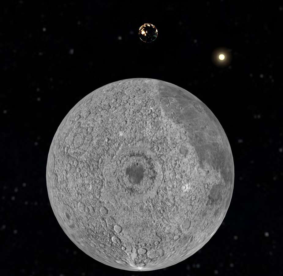
In the menu, there's a button called Find moon. Click it and the camera flies all the way to where the moon is right now and looks back at Earth. You'll see Earth the way the Apollo 8 astronauts saw it in 1968 — but with today's clouds and today's weather. Astronaut Bill Anders called that view the most important photograph ever taken, because it showed us how small and beautiful and alone our planet is.
🛰️ Space stations — people living in space
Right now, as you read this, there are people living in space. They live on space stations — big buildings that fly around Earth about 400 km up. That's higher than any plane, but much closer than the moon. earth-clock shows two of them: the International Space Station (the ISS, a pale blue marker) and China's Tiangong station (a coral-red marker). Click a station to see how many people are on board right now.
Orbits and tracks
In the Space row of the menu there are two buttons that sound alike but show different things:
- Orbits show the station's racetrack in space — a big ring around the whole Earth. The station goes round and round this ring, once every hour and a half. The ring stays still while Earth spins inside it.
- Tracks show the station's path on the ground — like a shadow drawn on the map, showing which countries the station is flying over.
Here's the clever bit. While the station goes once round its ring, Earth keeps spinning underneath it. So when the station comes back round, it's over a different part of the world! That's why the track on the ground is a wiggly wave that shifts a bit further west every time, instead of a neat circle. After a day or so, the ISS has flown over nearly everywhere people live.
Press Find ISS to fly the camera over the space station and see what the astronauts are flying over right now.
🗺️ Time zones — why is New York 5 hours behind London?
The Earth is a sphere. It spins all the way around in 24 hours. That means it rotates 360° ÷ 24 hours = 15 degrees per hour.
So every 15 degrees of longitude you travel east, the local time goes forward by one hour. And every 15 degrees west, it goes back by one hour. New York is about 75° west of London, which is 75 ÷ 15 = 5 hours behind.
Why don't the lines go straight?
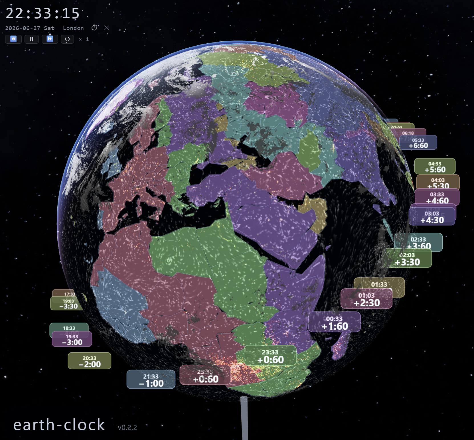
The real political time zones (try Time Zones in the menu) look very wobbly. That's because countries decided they wanted everyone inside their borders to have the same time, even if parts of the country are 15° away from where the line "should" be. China is nearly 5,000 km wide but uses only one time zone — that means the sun rises at completely different local times in the east and west of the country.
The colours
Each timezone gets its own colour. The colours are picked using a special trick from mathematics called the golden angle — the same angle that sunflower seeds use to pack themselves into a sunflower head. It makes sure that neighbouring time zones always get very different colours, so they're easy to tell apart.
🌌 What are auroras?
Auroras (the Northern Lights and Southern Lights) happen when tiny particles shot out from the sun crash into Earth's magnetic field near the North and South Poles. This makes the atmosphere glow in beautiful greens, purples, and pinks.
earth-clock shows a live forecast of where auroras are likely to be visible right now. It updates every 5 minutes using data from NOAA's Space Weather Prediction Center. If the aurora oval is glowing brightly near your country, it might be worth looking outside on a clear night!
🌑 Solar eclipses
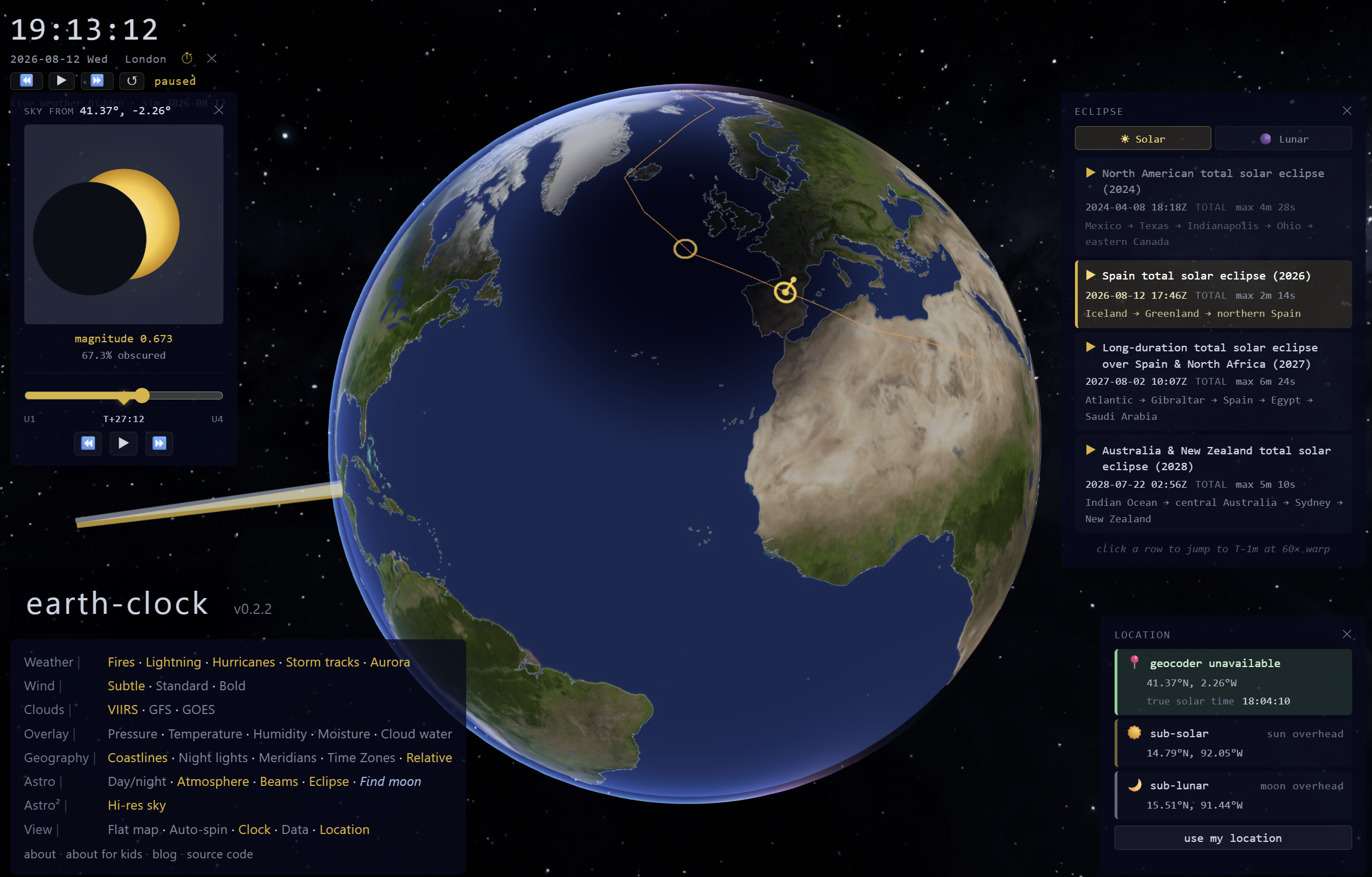
A solar eclipse happens when the moon moves exactly between the Earth and the sun, blocking the sunlight for a small patch of Earth. The patch of shadow is called the umbra, and it's only about 300 km wide — so only a thin strip of Earth sees totality (the sun totally blocked) as the shadow races across at about 3,000 km/h.
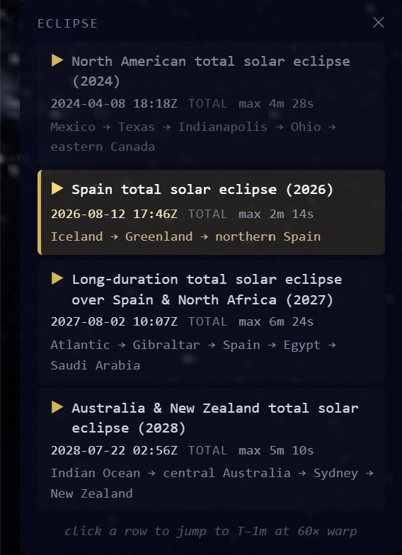
earth-clock has a built-in eclipse mode. You can jump to any upcoming solar eclipse and watch the moon's shadow race across the globe in fast-forward. The last big one over Europe was on 12 August 2026, crossing Spain. The next is a spectacular one on 2 August 2027 over Spain, North Africa and Egypt, and then one over Australia and New Zealand in 2028.
📡 Where does the data come from?
Almost everything you see on earth-clock is downloaded automatically from real scientific organisations:
- Clouds — NASA satellites taking pictures of Earth every day
- Wind and weather — NOAA (America's weather agency), using a supercomputer that runs weather forecasts every 6 hours
- Hurricanes and storms — NOAA's National Hurricane Center, updated every 15 minutes
- Lightning — a worldwide network of volunteer radio stations called Blitzortung, detecting lightning strikes within a fraction of a second
- Fires — NASA's FIRMS system, detecting heat from wildfires and forest fires using infrared cameras on satellites
- Auroras — NOAA's Space Weather Prediction Center, updated every 5 minutes
- Time zones — a global open-source project that maps every timezone boundary in the world, maintained by volunteers
- Earthquakes — the USGS (America's earthquake agency), updated every 15 minutes
- Volcanoes — the Smithsonian Institution's Global Volcanism Program, which keeps a record of every known volcano
- Tectonic plates — a scientific map of Earth's plate boundaries first published by geologist Peter Bird
- Space stations — CelesTrak, a website that publishes the exact orbit of thousands of satellites. earth-clock uses the orbit numbers to work out where each station is, second by second
All of this data is public and free — it's paid for by governments so that everyone can use it.
📍 Clicking on the globe
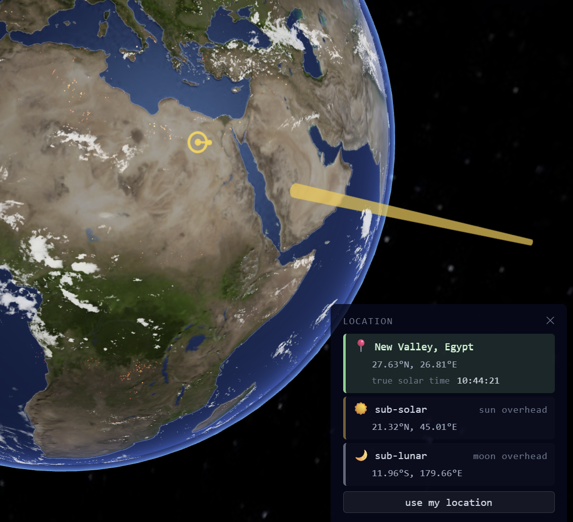
Turn on Location (in the View row of the menu) and then click anywhere on the globe. A pin drops, and a panel appears telling you the place name, the country, and what the local time is there right now.
You can also click the ☀️ button in that panel to drop the pin exactly where the sun is directly overhead — the hottest spot on Earth at this moment. Or click 🌙 to go to wherever the moon is directly overhead.
🔘 What does every button do?
Here's a guide to every option in the menu. Remember: click to turn on, click again to turn off.
Weather row
- Fires — red and orange pins showing where wildfires are burning right now. Detected every hour by NASA satellites using infrared cameras that can see heat through smoke.
- Lightning — white flashes showing real lightning strikes from the last few seconds. Updated live from a worldwide network of volunteer radio stations.
- Hurricanes — spinning spiral symbols on active tropical storms. Bigger and brighter = more powerful. Dotted lines show the 5-day forecast track.
- Storm tracks — the paths storms have already travelled.
- Aurora — glowing rings around both poles showing where the Northern or Southern Lights might be visible tonight.
Wind row
- Subtle / Standard / Bold — choose how strongly to show the wind. All three use the same real data; this just changes how bright the particles look. Bold is great for seeing big storms clearly.
Clouds row
- VIIRS — real satellite photos stitched together from yesterday's pass over every part of Earth. The clearest option.
- GFS — what the weather computer predicts the clouds look like right now.
- GOES — a live satellite feed, updated every 10 minutes, but only covers the Americas and parts of the Pacific.
Overlay row
These colour the whole globe to show weather data. Only one can be on at a time.
- Pressure — shows high and low pressure. High pressure usually means sunny weather; low pressure means storms and rain.
- Temperature — shows how hot or cold the air is everywhere right now. Blues are cold; reds are hot.
- Humidity — how much invisible water vapour is in the air. Humid air feels muggy and heavy.
- Moisture — total amount of water in the whole atmosphere above each point, including clouds.
- Cloud water — how much liquid water is actually inside clouds (as tiny droplets).
Geography row
- Coastlines — draws the outlines of all continents and islands so you can see where land and sea are.
- Night lights — on the dark side, shows city lights glowing from space. Bright patches = big cities. Dark patches = countryside, ocean, or very poor regions.
- Meridians — 24 perfectly straight timezone lines, one every 15°. The "ideal" way to divide the world into 24 hours.
- Time Zones — the real political timezone borders, with each zone filled in a different colour so you can see how wiggly they really are.
- Relative — changes the timezone labels to show how many hours ahead or behind each place is from where you are. So if you're in London, New York shows "−5:00".
Geology row
- Earthquakes — every earthquake from the past week. Bigger dot = bigger earthquake. Red = shallow, blue = deep underground.
- Plates — orange lines showing the edges of Earth's giant tectonic plates. Most earthquakes and volcanoes happen right along these lines.
- Volcanoes — over a thousand known volcanoes as small triangle markers. One glowing hot and pulsing means it might be erupting right now.
Astro row
- Day/night — the lighting effect that makes one side of Earth bright (daytime) and the other dark (night-time). Turn it off and the whole globe is lit equally — useful for seeing clouds everywhere at once.
- Atmosphere — the blue glow around the edge of the globe where the atmosphere is catching and scattering sunlight. This is why sunsets look orange from the ground.
- Beams — the gold arm pointing at the sun, the silver arm pointing at the moon, the blue stick Earth spins around (with N and S on the ends), and the two rings: the equator (blue) and the sun's yearly path (gold).
- Eclipse — opens a panel listing upcoming solar eclipses. Click any eclipse to jump to it and watch the moon's shadow cross the globe in fast-forward.
- Find moon — flies the camera all the way to where the moon is right now, then turns around to look back at Earth. Press the back button or drag the view to return.
Space row
- ISS and Tiangong — show or hide each space station. Click a station to see where it is, how high and fast it's going, whether it's in sunlight, and how many people are on board.
- Tracks — the path each station draws on the ground below it.
- Orbits — the ring each station flies around in space.
- Find ISS — flies the camera over the International Space Station.
Astro² row
- Hi-res sky — loads a much bigger, sharper star map in the background. Takes a moment to download but the Milky Way looks much better.
View row
- Flat map — switches from the 3D globe to a flat 2D map of the world (like a normal wall map). Everything still updates live.
- Auto-spin — makes the globe spin slowly on its own, so you can watch the whole world go by without touching anything.
- Clock — shows or hides the clock in the top-left corner, which displays the current UTC date and time.
- Data — opens a panel showing where every layer's data comes from, how old it is, and whether it loaded successfully.
- Location — lets you click anywhere on the globe to see the place name and local time there.
🔭 Things to try
- Drag the globe to spin it and look at different parts of the world.
- Scroll to zoom in or out — zoom in on a hurricane, or zoom way out to see the whole solar neighbourhood.
- Turn on Meridians (Geography menu) and count the timezone lines — there are 24, one for each hour of the day.
- Turn on Time Zones and find your own country. What colour is your timezone?
- Click Eclipse in the Astro menu and jump to the 2026 eclipse over Spain. Hit play and watch the shadow race across Europe.
- Click Find moon (Astro menu) and look back at Earth from space.
- Click Find ISS (Space menu). Which country are the astronauts flying over right now? Is it day or night for them?
- Turn on Aurora (Weather menu) and see if the northern lights are active tonight.
- Turn on Volcanoes and Fires (Geology + Weather menus) together and look for a volcano glowing hot — that means it's erupting right now.
- Click anywhere on the globe to find out what city or country you clicked on.
- Turn on Beams and find the little arrow near the North Pole. Which way is Earth spinning?
Say hello
earth-clock was made by Caspar Addyman. If you have a question, a brilliant idea for something new, or you just want to show me something you noticed on the globe, I'd love to hear from you: